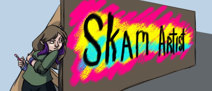
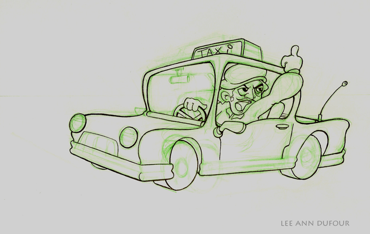
 I did not design or draw this layout (above) but I did colour it in photoshop as our first painting asignment of this semester.
The next one was also given to us, but as part of a layout assignment everyone had to draw the same layout from a slightly different angle as the example we were given. This was not painted from my layout but is pretty much exactally the same anyway. The assignment was to remove all the lines so I only put a stroke along the edges that I wanted to excentuate.
 And in 3d, I modeled my digital camera. Which I still can't find the cord to! Ahem, the only problems I have with it was a lack of rounded edges and it's not shiney enough. I also did the back of the camera but this is the only rendered image I took of it. I made it so that it could be rigged to actually move like a camera, but I don't know how to rig yet so I didn't go that far.
As for the animations, I'm uploading them as I type this there are 3 assignments from animation class and one layout I did. So I'll link to them once the extreamly long process of uploading ends.


_blog.jpg)

2 comments:
I really like the plastic look on your kitchen looks like something from toystory!
Great painting job on the layouts! As for the camera, it's a nice start, but I'd try doing some bevels to get the rounded edges you need, plus some simple textures and decals could push the look and feel of it just a bit.
Post a Comment